
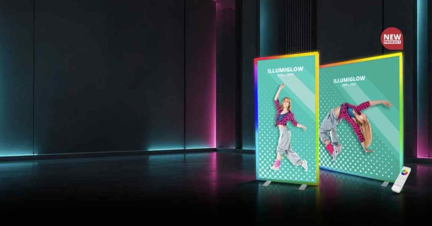
Planning an event display requires balancing message hierarchy, material selection, viewing distances, and spatial layout. Whether setting up a temporary trade show booth, a outdoor pop-up market, or a permanent indoor informational display, physical signage serves as a primary point of navigation and engagement for attendees. Without a clear plan for scale, typography, and placement, large-format graphics can easily turn into cluttered, illegible visual noise.
Designing effective visual displays requires understanding how light, distance, and environmental conditions affect printed graphics over time. Selecting durable substrates and high-contrast color palettes ensures that key messaging remains readable from a distance under varying lighting conditions. When planning event displays or temporary directional signage, reviewing technical specs from regional print specialists like AlphaGraphics Charleston can help clarify options regarding outdoor weather resistance, mesh ventilation, and matte vs. glossy material finishes.
Choosing the Right Substrate: Vinyl, Fabric, and Paper
Selecting the right material depends on where the display will be located, how long it will stay up, and how far away viewers will be standing.
Heavy-Duty Vinyl (13 oz to 18 oz)
Vinyl remains one of the most durable choices for outdoor displays and high-traffic areas.
- 13 oz Vinyl: Best for short-term indoor or light outdoor applications where wind exposure is minimal.
- 18 oz Heavyweight Vinyl: Built for long-term outdoor exposure, offering high tear resistance against wind gusts.
- Mesh Vinyl: Features small perforations that allow wind to pass directly through, making it ideal for large fence wraps, scaffolding, and open outdoor spaces.
Polyester Fabric
Fabric banners offer a soft, non-glare finish that looks high-end under indoor lighting. They are lightweight, easy to fold without creasing, and machine-washable, making them ideal for trade show backdrops, media walls, and interior retail displays.
Coated Paper Stocks
Coated poster paper works best for short-term indoor displays, wall frames, and easel presentations. Matte coatings prevent glare under harsh fluorescent lighting, while gloss finishes increase color vibrancy for photo-heavy designs.
Typography, Hierarchy, and Viewing Distance
A large banner mounted high on a wall requires different font sizes than a poster viewed up close in a hallway. Designing for scale requires matching text size to the viewer’s distance.
+————————–+———————–+———————–+
| Viewing Distance | Minimum Text Height | Recommended Application|
+————————–+———————–+———————–+
| 4 Feet (Up Close) | 0.25 to 0.5 Inches | Instructional Posters |
| 10 Feet (Walk-By) | 1.0 to 2.0 Inches | Directional Signs |
| 20 Feet (Medium Range) | 2.0 to 4.0 Inches | Booth Headers |
| 50+ Feet (Far Distance) | 6.0+ Inches | Outdoor Roadside Signs|
+————————–+———————–+———————–+
Key Principles of Visual Hierarchy
- Primary Focus (H1): Keep the main title under six words so passersby can process it in under three seconds.
- Secondary Details (H2): Group supporting details—such as dates, locations, or key benefits—into small text blocks directly below the main headline.
- Contrast Ratios: Use dark text on light backgrounds (or white text on deep black or navy) to maintain high legibility under changing light.
Mounting Methods and Hardware Selection
Choosing the proper mounting hardware prevents banner sagging, corner tears, and safety hazards during setup.
- Grommets and Bungee Cords: Metal eyelets placed along the edges allow banners to be secured tightly to fences, frames, or walls using flexible cords that absorb wind stress.
- Pole Pockets: Top and bottom loops stitched into the fabric allow mounting poles to slide straight through, ensuring a flat, wrinkle-free display without visible wall attachments.
- Retractable Roll-Up Stands: Portable aluminum bases protect the graphic roll during transport and allow rapid, single-person assembly at trade shows.
- Adhesive Strips and Frames: Snap-open poster frames allow quick media swaps for indoor wall displays while keeping edges flat and protected from wear.
Spatial Placement and Traffic Patterns
Even the best-designed banner fails if placed outside a viewer’s natural line of sight. Mapping visitor movement through a venue ensures displays are positioned for maximum exposure.
- Sightline Alignment: Place key messaging at eye level—typically between 4.5 and 6 feet off the floor—in walking corridors and waiting areas.
- Overhead Clearance: Mount main directional signage above 7 feet in crowded spaces so information remains visible over the heads of walking crowds.
- Lighting Considerations: Position displays away from direct sun glare or harsh spotlights that create reflections and reduce text contrast.