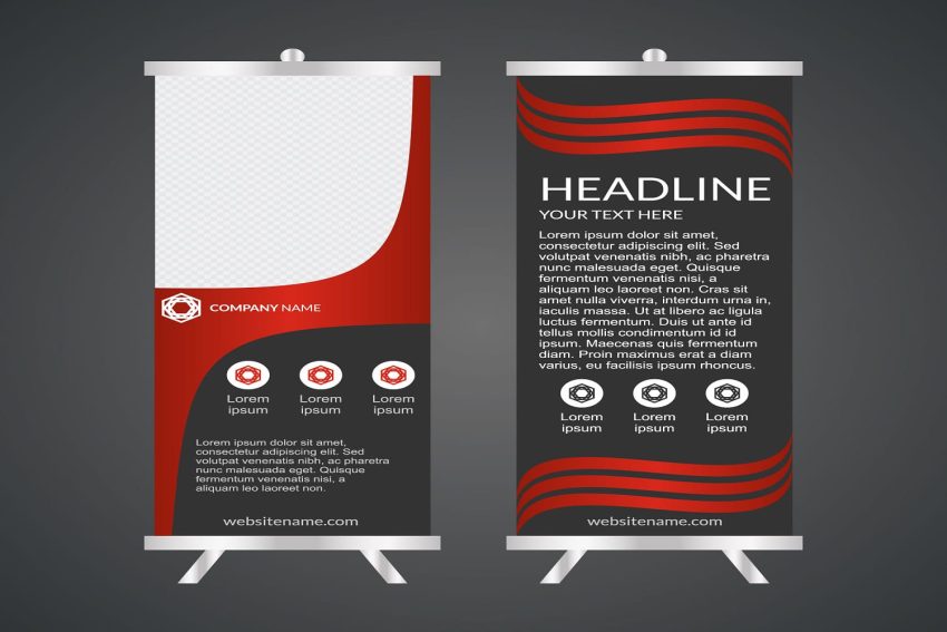
Watch someone walk past a trade show booth and you’ll witness the brutal truth about pull up banner design – you have exactly 1.3 seconds to grab their attention before they move on. That’s less time than it takes to read this sentence, which means every design element needs to work harder than you think.
The 3-Metre Readability Test Most Designers Ignore
Your brilliant 14-point font becomes invisible beyond arm’s length. Professional designers test readability from three metres minimum – the distance people maintain in crowded spaces. Headlines need 48-point minimum, subheadings 36-point. Anything smaller wastes printing costs and foot traffic.
Colour Contrast That Actually Works Under Exhibition Lighting
Those trendy pastel combinations look stunning on your monitor but disappear under harsh exhibition hall fluorescents. High contrast ratios of 7:1 minimum ensure visibility regardless of lighting conditions. Navy text on light backgrounds outperforms black on white under artificial lighting – something most brand guidelines miss.
The One-Third Rule for Visual Hierarchy
Divide your banner into thirds vertically. Top third for grabbing attention, middle for your core message, bottom for contact details. Cramming everything into the middle third creates visual chaos that readers abandon within milliseconds. White space isn’t wasted space – it’s reading guidance.
Image Quality That Survives Large Format Printing
Your 72dpi web images become pixelated disasters at banner size. Minimum 300dpi at final print dimensions prevents embarrassing blur that screams amateur. Stock photos sized for web use cost you credibility when blown up to a 2-metre height. Pop-up banners in Brisbane exhibitions regularly feature pixelated disasters that could’ve been avoided with proper file preparation.
Typography Choices That Command Attention
Sans-serif fonts like Arial or Helvetica remain readable at distance, whilst decorative fonts become illegible beyond two metres. Maximum three font variations per banner – more creates visual confusion. Bold weights for headlines, regular for body text, never use light weights for anything important.
Call-to-Action Positioning That Converts
Bottom-right corner placement follows natural reading patterns in Western cultures. QR codes need 40mm minimum size for reliable smartphone scanning. Phone numbers require larger fonts than web addresses – people squint at mobile screens differently than they read URLs.
Print Specifications That Prevent Disasters
Bleed areas of 10mm prevent white edges when trimming varies. CMYK colour profiles avoid printing surprises – RGB colours shift dramatically in print production. Effective pull up banner design accounts for these technical realities during the creative process, not as afterthoughts during production panic.

