
Have you ever walked into a large building and felt instantly confused? You look around for a reception desk or a map, but you cannot find one. It is a frustrating feeling. It wastes time and creates anxiety.
Whether you manage a hospital, a university campus, or a large office block, helping people find their destination is a top priority. This is why investing in clear directional signage is essential for any physical business.
These signs, often called wayfinding signs, are the silent guides of your facility. They do not just point left or right. They improve the overall experience of everyone who steps through your doors.
Reducing Stress for Visitors
The main job of a wayfinding sign is to make life easier. When a customer or client enters your space, they are often in a hurry. They might be late for an appointment or looking for a specific product. If they cannot find where they are going, their stress levels go up.
A frustrated visitor is not a happy customer. They might leave with a bad impression of your brand, even if your service is excellent. By placing clear signs at key locations, you remove that frustration. You make the visitor feel smart, capable, and welcome. It shows that you care about their comfort and their time.
Keep It Simple and Clear
Designing these signs requires a specific approach. This is not the place for complex art or fancy cursive writing. The goal is instant recognition.
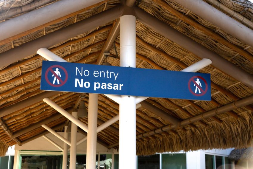
You should use bold, easy-to-read fonts. High contrast is also vital. Black text on a white background, or white text on a dark background, works best. People need to be able to read the sign from a distance.
Also, rely on universal symbols. Everyone knows what a restroom icon or an elevator symbol looks like. Using these standard pictures helps people process information faster than reading words.
Consistency is Key
Your signs should look like a family. They need to be consistent in color, size, and material. If your first sign is blue and metal, the next one should not be red and plastic.
Consistency helps the brain. Once a visitor recognizes what your directional signs look like, they will subconsciously look for that same style at the next intersection. It creates a visual path that is easy to follow. It also makes your building look professional and organized.
Strategic Placement
You can have beautiful signs, but they are useless if they are in the wrong spot. You need to place them at “decision points.” These are areas where a person has to make a choice.
Think about lobbies, elevator banks, stairwells, and hallway intersections. If a person has to pause and guess which way to turn, you need a sign there. It is also good to have “reassurance signs.” These are placed along long corridors just to tell the person they are still going the right way.
Final Thoughts
Navigation is a critical part of customer service. You don’t want your staff to spend all day giving directions instead of doing their actual jobs. Good signage solves this problem. It keeps traffic flowing smoothly and keeps visitors happy.
Take a walk through your building today and pretend you are a stranger. If you get confused, it is time for an upgrade.